Recently I’ve been thinking about the failure of contact tracing apps to put a meaningful dent in transmission of COVID-19. At the beginning of the pandemic when Apple and Google announced their contact tracing protocol, I was instantly concerned that ensuring privacy would be key to user adoption. Boy was I wrong.
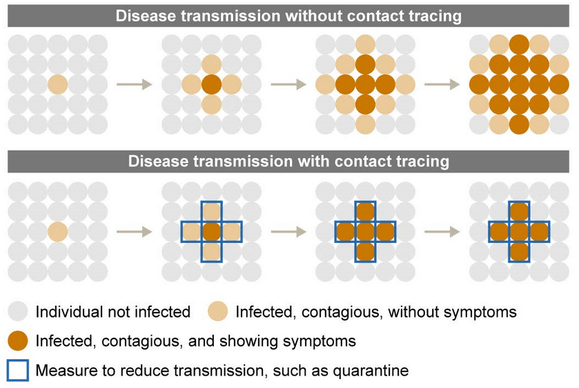
Our friends at the Government Accountability Office have done a lot of good work on this topic. In reading their report, Benefits and Challenges of Smartphone Applications to Augment Contact Tracing, I was struck as a product manager by the absence of evidence from end users. While privacy concerns were cited by many “state officials” as a reason for the lack of adoption, there wasn’t any evidence presented on the magnitude of the impact. As we’ve seen, there is a very loud, but small contingent of people who see conspiracies behind every corner and my speculation is that these “state officials” were suffering from observation bias: those folks showed up and made noise, so they must be representative. The reality is that privacy was afforded such high priority that it has proven nearly impossible to evaluate the effectiveness of the apps. Buried deep in the policy recommendations almost as an afterthought, however, was where I think the primary failure lies:
“Also, understanding and
appealing to user motivations could
promote app adoption.”
States didn’t bother to talk to end users and understand what would be valuable to them. In the midst of a crisis, they assumed that the benefit of being notified if you were exposed and the desire of many of us to pitch in to help would be enough to compel broad adoption, and that assumption was wrong. This, unfortunately, is not surprising. Most of your assumptions when you conceive of a new product or service will be wrong. In the micro-focus group of my friends, family, and co-workers, I enthusiastically encouraged folks to download the Virginia exposure notification app COVIDWISE expecting people to be unaware or concerned about their privacy. The most common response I got was, “Yeah I downloaded it. I’m not really sure if it’s working.” People downloaded the app, and promptly forgot about it. To drive broad adoption, these apps need to have features that provide value to the end user. To that end, here are three features for the COVIDWISE backlog. They’re aimed at a central piece of value we could all use: better information to make decisions on how much risk to take and when.
Exposure Risk Level
Did you have that friend who “really locked it down” and then proceeded to tell you about how they were only going to the grocery store, and the gym, and target, and the mall? And they were only seeing people who lived on their street, and families their kids go to school with, and they only had four people over for dinner last night instead of eight? Well even if you’re not getting exposure notifications, your phone’s system is keeping a list of the randomly generated keys it comes in contact with each day. It would be fairly easy to produce a count of close contacts so users could track their own exposure risk and have a numeric value to share with friends when making decisions.
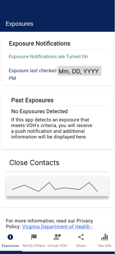
A graph of close contacts could give you a better sense of you exposure risk.
Customized Alerts
These days you can set proactive alerts for all sorts of things: when it’s going to rain, when your car needs maintenance, when the price of a stock changes. Rather than having to pull up the COVID dashboards and assess your risk every day, wouldn’t it be nice if you could set custom alerts for when case counts, or positivity rates go above your personal risk tolerance, or back down? This would require making the data available natively in the app, but since it is VDH’s data, it shouldn’t be that hard.
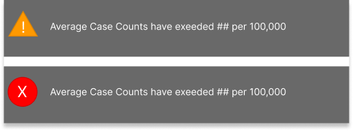
Push notifications on your phone would alert you based on your customized settings
Forecasts
One of the hardest things to do in the pandemic has been to plan ahead. From weddings to dinner parties, we’ve all had to just accept the uncertainty that the pandemic has inserted into our planning process. There are, however, teams of really talented and skilled disease modelers creating, updating, and improving COVID forecasts across the country. Rather than keeping these forecasts in the hands of government officials, share them with the public through the app like a weather forecast.
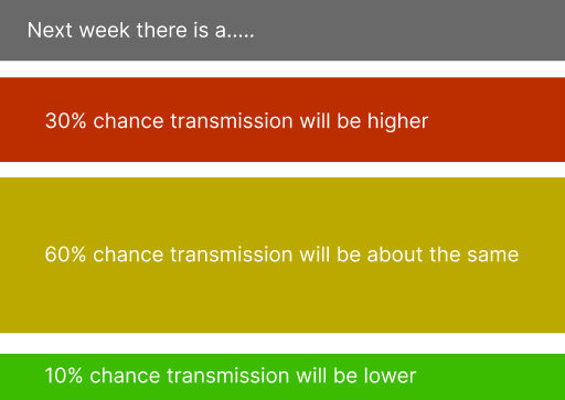
Check the weather. Hot, humid, with a chance of afternoon thunderstorms and COVID exposure. Sounds like August in DC!
Value for the User
Ultimately these features, or features like these that deliver value for the end user are what is needed to drive broader adoption of exposure notification apps. Addressing many of the other issues identified in the GAO report will also help improve their usefulness to reducing the spread of COVID. Longer term these technologies can provide useful public health tools for mitigating other disease outbreaks so we should not give up on them.
